Product, Identity Design and Illustration
Akigora

Year: 2023
Project type: Website redesign
Scope: Identity, UX/UI and illustration
Duration: Six weeks
Tools: Figma, Adobe Illustrator, Photoshop
Based in Bordeaux, Akigora carefully puts experienced freelancers in contact with companies and educational institutions who seek their expertise.
The challenge
While sign-up rates were high, many recruiters didn't return to the platform, opting for calling directly on the phone.
Akigora assigned me to investigate the reasons and propose a design solution.
The Process
Step 1: Empathize
A. Secondary Research
I conducted secondary research on Akigora's industry, market, and user behavior. This included reading articles, analyzing Google Reviews, and listening to a 1-hour interview with founder Guillaume Mouzet.

B. Competitive Analysis
I assessed Akigora against its competitors (Malt, Tenors, LeHibou, and Comet) to understand strengths, weaknesses, and opportunities for a better user experience.

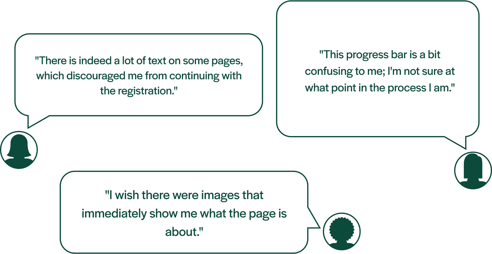
C. User Interviews
I conducted one-on-one interviews with Akigora users to understand their platform usage, likes, dislikes, and challenges. Here's what they said:

D. Heuristics Evaluation
Through a heuristics analysis I identified usability issues that needed to be resolved in order to make the sign-up process as intuitive and easy as possible for recruiters.
Step 2: Ideate
A. User Persona
From what I found in my research, I put together a user persona to inform the design phase.

B. User Journey
Next, to understand Julie's perspective and pain points, I created a visualization outlining her interactions with Akigora, from initial encounter to task completion.

C. Problem Statement

Step 3: Ideate
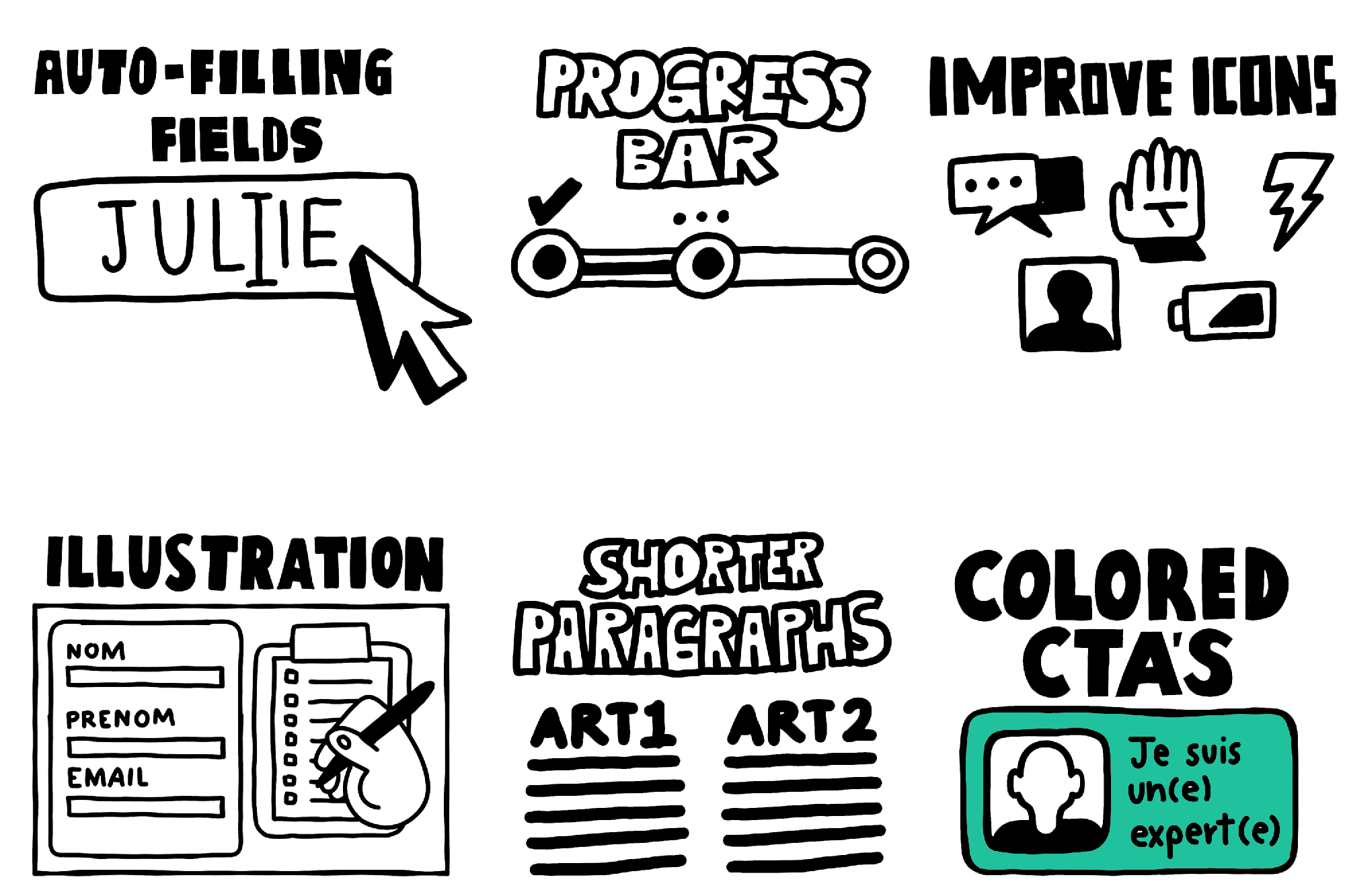
A. Worst Idea
First, I did a "worst idea" exercise, which sparks innovation by kicking things off with the most counterintuitive design ideas.

B. Crazy 8’s
Next, I did a "Crazy 8's" brainstorm, a speedy technique where you try to generate many design ideas in eight minutes.
Step 4: Prototype
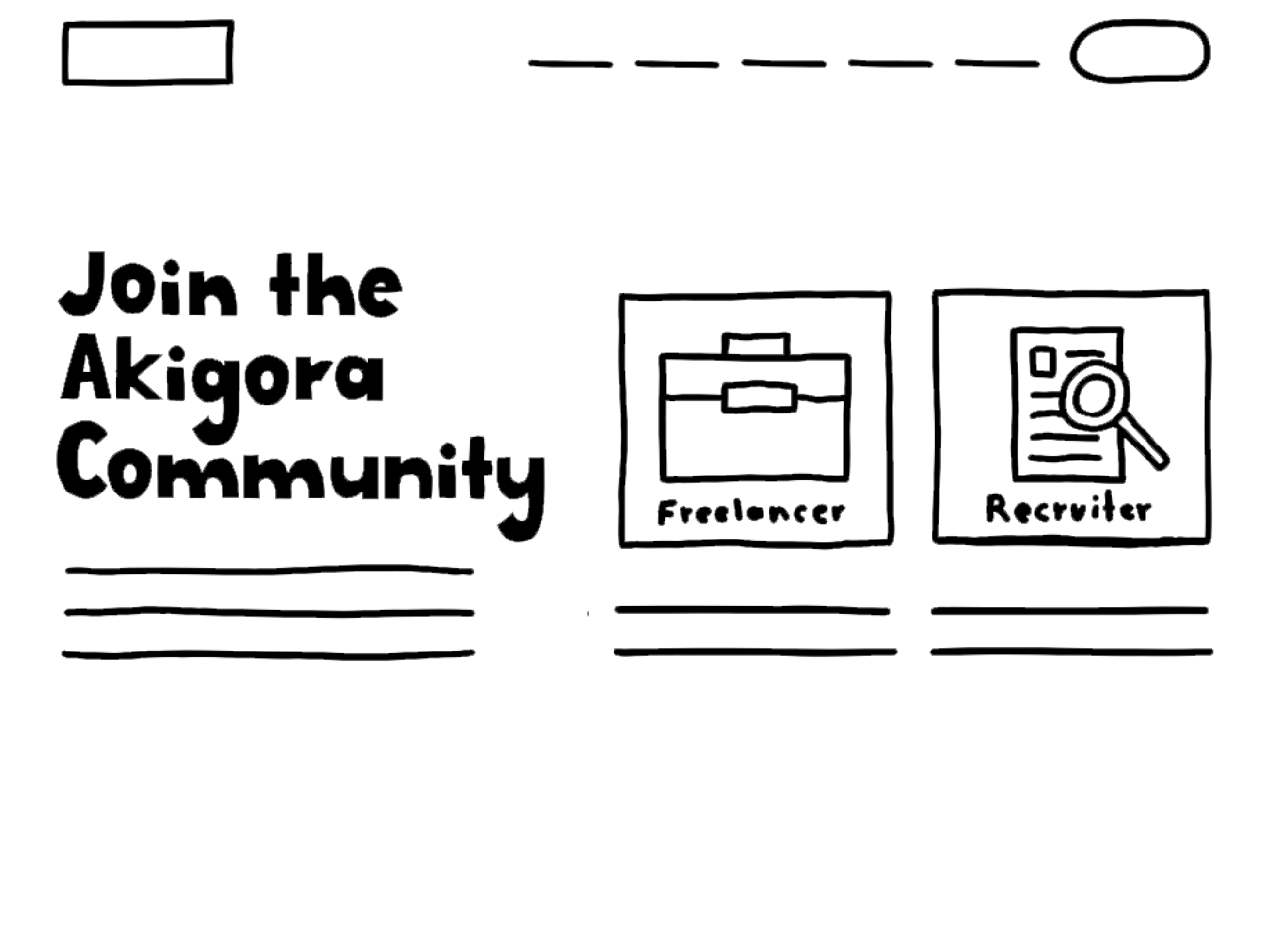
A. Lo Fidelity Prototype
At this stage, I just sketched out some basic ideas on paper for the user interface focusing on the functionality rather than the aesthetics.
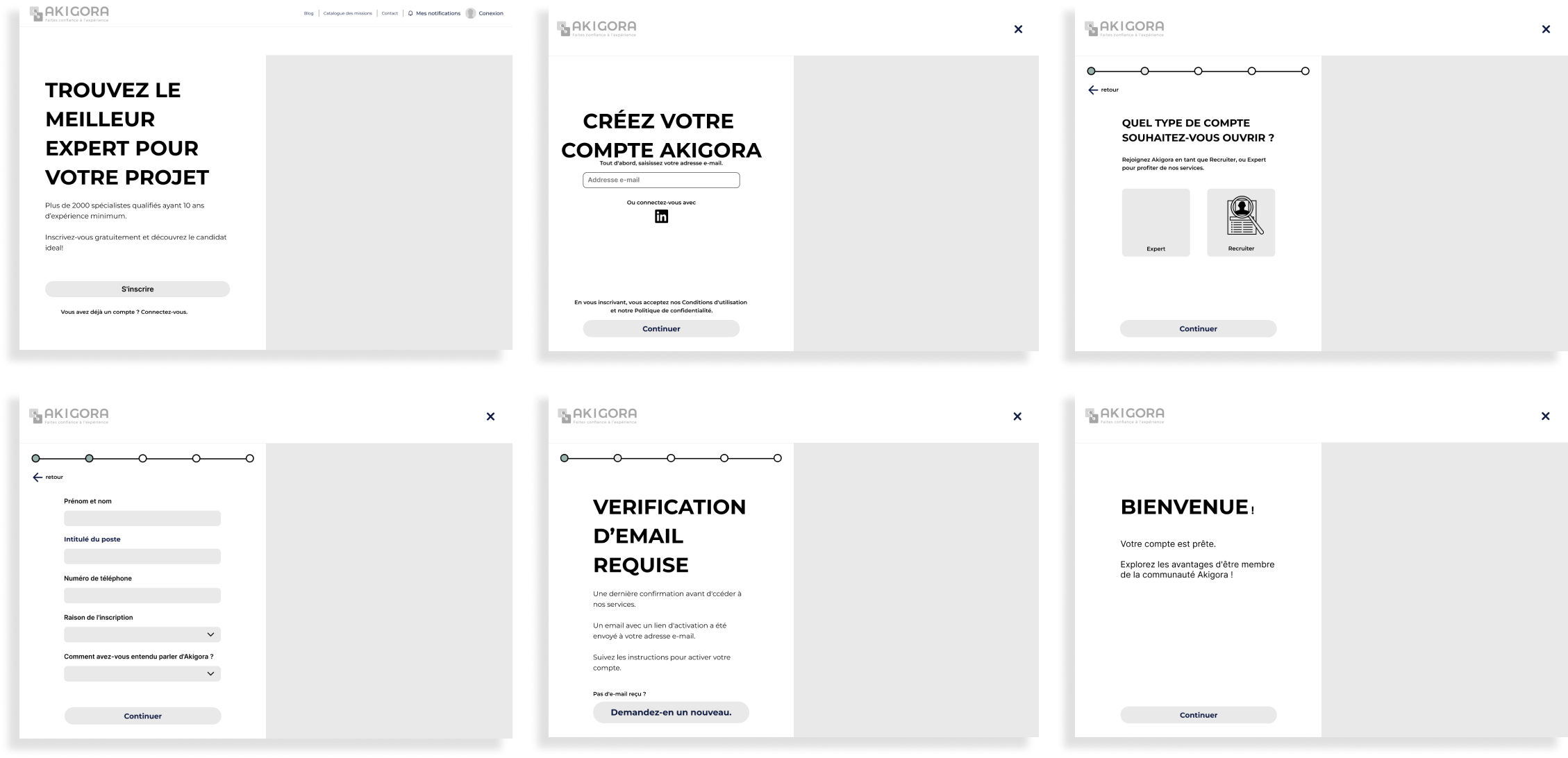
B. Medium Fidelity Prototype
I made a mid-fidelity prototype to make the design feel more real, still prioritizing functionality over perfection.
C. Usability Test
I evaluated the efficiency of the prototype to identify problems and gather feedback by observing 3 separate users interact with it in real time.